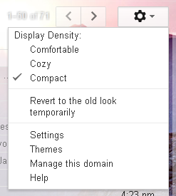
Save space with the new gmail look!
Nov 10, 2011 · 1 minute readCategory: email
This is post is now quite old and the the information it contains may be out of date or innacurate.
If you find any errors or have any suggestions to update the information please let us know or create a pull request on GitHub

