Firefox and Responsive Web Design
Jan 10, 2013 · 2 minute readCategory: css
Responsive web design is an excellent way to make a site work really well for a variety of different screen sizes without having to serve more than one design to users. Responsive web design does pose additional challenges however.
Some of the challenges for you, as the developer, are being able to implement, test and debug the design implementation. Fortunately built in to Firefox’s arsenal of developer tools is an interface for exactly that!
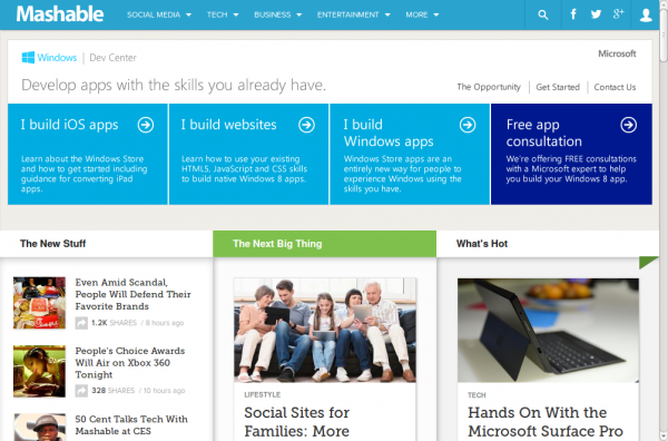
Lets take a website that uses a responsive design:
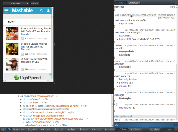
 Here is the ‘mobile’ view:
So every thing is normal you can use the developer tools and Firebug or whatever. If you then need to make changes to the smaller version and use Firebug you would have to pop out Firebug (which may or may not be to your preference) then resize the main window. This works ok but Firebug currently isn’t great for working with responsive designs as it doesn’t show you all the rules that might apply based on the screen size and other conditions. This is one area that the Firefox built in tools beat Firebug. The styles editor shows you all rules that could apply and their conditions.
To activate Firefox’s responsive design view press Ctrl + Shift + M. You can open the inspector and stlyes by pressing Ctrl + Shift + I. You can also access the responsive design view by going to Tools > Web Developer. With responsive design view enabled you can still use Firebug without a problem, unless you enable the built in element inspector then you kind of lose loads of screen space.